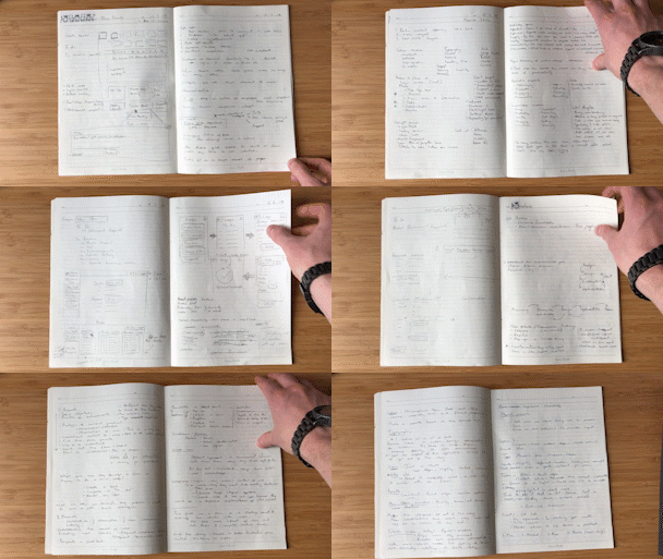


For an interview, I was asked to come up with a redesign for an existing platform to demonstrate my “design thinking” for an existing platform that manages financial compliance for businesses. I produced two new design systems, an interactive wireframe built with Adobe XD and a front-end, responsive prototype developed using HTML/CSS and JavaScript. Along with a presentation to explain the reasoning behind my decisions.
The existing product is a huge business application with many different tools and available for users. I was given an introduction and initial overview of the product from the Product Owner. I orgnaised interviews with various team members to stand in for users), this aided in the development of user personas for different scenarios. For instance, registering a corporate lunch:
I carried out guerilla user testing to see if the user could work out how to accomplish a task without instruction. This observation showed that attempting to complete key tasks was not entirely obvious with the current iteration.
Other discoveries from my research showed several areas that could be addressed:
I decided to focus on three main areas from the application:
The extra areas I would include to give myself an edge would be to come up with two light and dark themes and a responsive design and build that they could be loaded and passed around a tablet during the presentation.
With a definition of objectives and analysis of the current product in hand, I began by mapping out how the processes could work, followed by wireframing on paper. I quickly moved to Adobe XD to flesh out these ideas. XD allows easy sharing and feedback comments and fast development interactable ideas.
I decided to implement a stepped process for completing tasks. This would have the benefit of not overwhelming the user and showing clearly what would be involved. The stepped process would be able to be used for all tasks - funneling a user through the processes involved and showing the user what they have to do. At the end of the process there would be clear feedback for the user that stays on the screen until acknowledged (something that wasn’t present in the product).


